Seeing the Unseen: The Power of Log Scales in Numerical Simulation
Why Your Linear Plots Are Lying to You
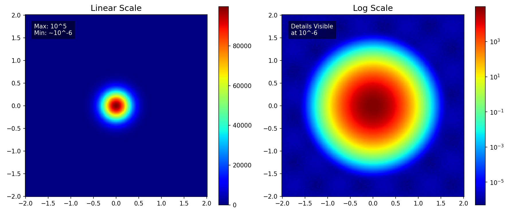
Numerical simulations—whether they be CFD, FEA, or Electromagnetics—often yield results with a massive dynamic range. You might be looking at a maximum pressure of $10^5$ Pa, while trying to resolve acoustic waves of $10^{-2}$ Pa in the same domain.
When rendered on a standard linear scale, the visualization is dominated by the maximums. This creates a deceptive “hotspot” effect: the peak value burns bright red, while the rest of your domain—containing all the intricate, lower-magnitude physics—is washed out into a uniform, featureless blue.
This happens because linear scales treat data additively ($10, 20, 30…$). However, many physical phenomena behave multiplicatively or exponentially. By forcing such wide-ranging data into a linear framework, you are effectively hiding the story of your simulation in the “noise floor”.
In the comparison below, the linear plot (left) shows only the central peak. In contrast, the log scale (right) immediately reveals the complex, low-amplitude wave structure in the background that was previously invisible.
Handling High Dynamic Range: Revealing the Details
The primary reason for using a log scale is managing data with a high dynamic range—where the maximum value is millions of times larger than the minimum significant value.
| Aspect | Linear Scale | Log Scale |
|---|---|---|
| Range Division | Equal intervals (e.g., 0-10, 10-20) | Equal ratios (e.g., $10^1$, $10^2$, $10^3$) |
| Small Values | Visually indistinguishable from zero | Clearly visible and distinguishable |
| Best For | Additive comparisons | Multiplicative/ratio comparisons |
Key Applications: Analyzing fields such as turbulent energy dissipation, which can vary rapidly, or chemical concentration profiles.
Analyzing Convergence: Tracking Relative Error
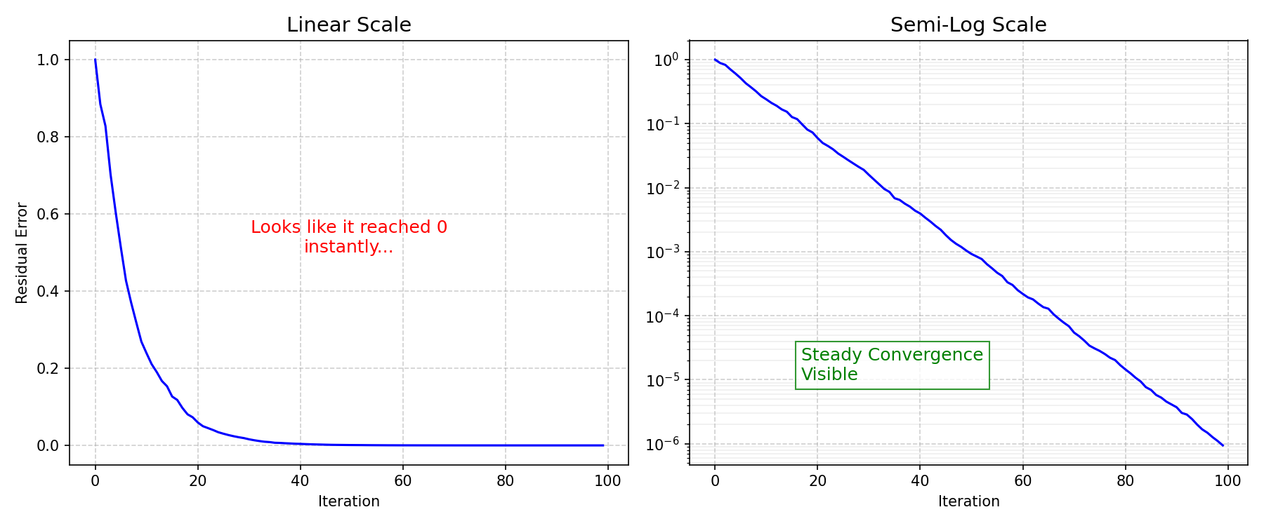
In iterative numerical solvers, judging the quality of a solution is paramount. This is where plotting residual errors comes in.
The Problem: Residuals measure the error remaining after each iteration, decreasing from a high starting value (e.g., $10^0$) down to a specified tolerance (e.g., $10^{-6}$). On a linear plot, the entire convergence history would look like a sharp vertical drop followed by a horizontal line on the x-axis.
The Solution (Semi-Log Plot): Plotting residuals on a logarithmic Y-axis transforms the exponentially decreasing error into a straight or steadily declining line. This allows you to instantly verify:
- If the solution is truly converging (the line keeps dropping)
- If the convergence rate is smooth or oscillatory
Identifying Physical Laws: Exponential and Power-Law Relationships
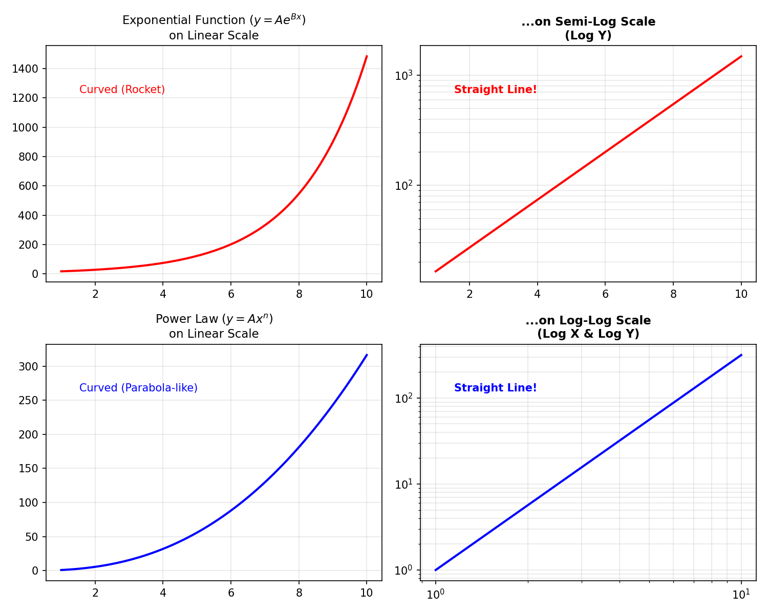
Many physical phenomena—from radioactive decay to fluid damping—are governed by exponential or power-law relationships ($y = Ae^{Bx}$ or $y = Ax^n$).
| Relationship | Plot Type | Result |
|---|---|---|
| Exponential ($y = Ae^{Bx}$) | Semi-log (Y-axis log) | Straight line, slope = $B$ |
| Power law ($y = Ax^n$) | Log-log (both axes) | Straight line, slope = $n$ |
Analyzing the slope of the resulting straight line directly gives you the exponent, allowing for easy comparison with theoretical models. This is particularly useful in frequency response analysis (Bode plots).
Real-World Examples in COMSOL Multiphysics
Theoretical explanations are great, but let’s look at how this applies to actual simulation scenarios.
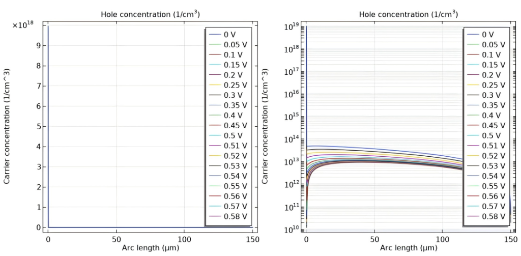
Case Study 1: Carrier Concentration in Solar Cells (Semiconductor Module)
Model: Si Solar Cell 1D (Application ID: 35661)
The Scenario: Modeling a silicon solar cell involves tracking charge carriers whose concentrations vary by orders of magnitude. The figure below shows the Hole Concentration profile under different applied voltages.
| Scale | What You See |
|---|---|
| Linear | You can only see the peak doping near the contact. The curves for different voltages ($0\text{V} - 0.58\text{V}$) result in indistinguishable vertical lines. |
| Log | Reveals the full exponential decay profiles. Crucially, it clearly separates the curves for different voltages, allowing you to analyze the effect of bias on carrier concentration. |
Case Study 2: Skin Effect in Power Inductors (AC/DC Module)
Model: Inductance of a Power Inductor (Application ID: 1250)
The Scenario: Power inductors are a central part of many low-frequency power applications, such as switched power supplies for computers. In this model, which calculates inductance from material parameters, the skin effect is a key phenomenon. The alternating current (AC) concentrates at the surface of the coil, decaying rapidly towards the center.
| Scale | What You See |
|---|---|
| Linear | Only a thin, high-intensity ring at the surface. The entire internal cross-section appears blue (zero current). |
| Log | Clear gradient of current penetrating the conductor, revealing the exponential tail of the current distribution. |
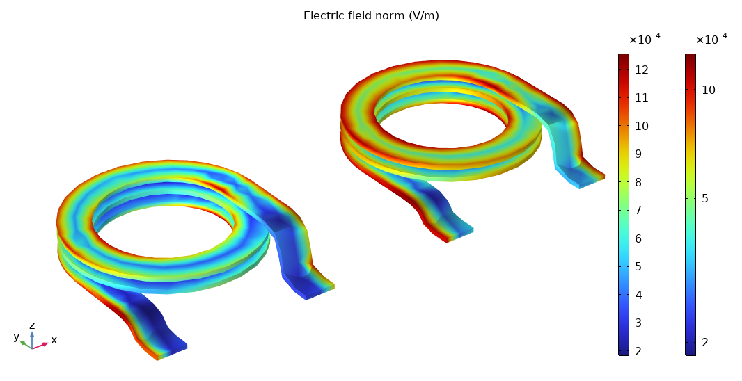
By setting the Color scale to Logarithmic in COMSOL plot settings, you can visually verify the calculated skin depth.
Decision Flowchart: When to Use Log Scale
Use the following flowchart to decide which scale is appropriate for your data:
flowchart TD
    A[Start: Analysis Goal] --> B{Data spans
multiple orders?}
    B -->|Yes| C{Physical Behavior?}
    B -->|No| D[Use Linear Scale]

    C -->|Exponential Decay
e.g. skin effect, convergence| E[Semi-Log Plot
Log Y axis]
    C -->|Power-Law
e.g. frequency response| F[Log-Log Plot
Log X & Y axes]
    C -->|Field Distribution
e.g. concentration| G[Log Color Scale]

    E --> H{Values <= 0?}
    F --> H
    G --> H

    H -->|Yes| I[Plot Magnitude abs
or Add Offset +eps]
    H -->|No| J[Apply Log Scale Directly]

    I --> K[Interpret Patterns]
    J --> K
    D --> K
Best Practices Summary
| Goal | Scale to Use | Why |
|---|---|---|
| Visualize high dynamic range data | Log Axis | Distinguishes values far from the maximum |
| Track residual convergence | Semi-Log (Y-axis log) | Transforms exponential decay into a straight line |
| Verify a power-law relationship | Log-Log (Both axes log) | Converts the curve into a straight line whose slope is the power |
Conclusion
Don’t let your linear plotting defaults hide the physics. Next time you analyze a simulation result, remember to try the log scale—it might just reveal the most important details you were missing.